
My favorite part of design is the research.
And I did a lot of research about Cha Cha Chá for this project. I started with absolutely no knowledge about the genre and I had to become familiar enough with it to create a convincing best-of LP.
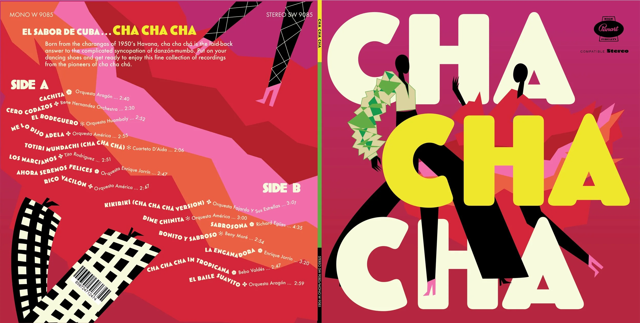
An important lesson that I learned in design school is that you can’t just fake your way through a project. Sure, you can just make something that’s pretty. But for a consumer to actually engage with your design, you need meaning and familiarity with your subject.
Cha cha chá is all about movement and rhythm. Those qualities informed my design choices: dynamic dancers, energetic colors, and text that dances along with the tracks.
Fonts:
Bovine Round MVB Regular
Futura
Colors:
CMYK 12 98 84 2
CMYK 27 96 32 2
CMYK 8 3 92 0
CMYK 3 0 16 0
Project Scope:
Illustration
Packaging
* Winner of 2022 American Advertising Awards Student Silver Addy in Packaging *
and a bonus design from the cutting room floor:
